UserVoice Design System
A case study by Joshua Rudd
As UserVoice began growing its product, design, and engineering teams, we needed to find a way to increase the speed and efficiency of design and development cycles while also delivering quality user experiences across a broad platform. To do this, we began an initiative to formalize our design system using Confluence, Abstract App, and conversation.
Position
- Director, User Experience
Company
- UserVoice
Responsibilities
- Documentation
- Process and tool selection
- Interaction design
- UI design
Tools
- Confluence
- Sketch
- Abstract
Date
- 2016-2017
The challenge
For years UserVoice remained small and didn’t have much turnover. It had been relatively easy to keep the design and user experience consistent and for everyone to be on the same page. However, as we began to grow and feature development divided between multiple cross-functional teams, it quickly became apparent: we needed to a better way to scale our teams while keeping our platform cohesive and consistent.
Our objectives were to:
- Empower cross-functional teams to autonomously deliver new features while increasing overall cohesiveness of the platform.
- Speed up feature delivery.
- Increase shared understanding, camaraderie, and trust within the design team.
Hypothesis
We hypothesized that if we codified our design system and processes, we could empower autonomous teams to deliver solutions faster while increasing the quality and cohesiveness across all experiences.
Constraints
- We had no dedicated Design Ops or tools team to create and maintain the system.
- Proposed changes to existing designs could only be applied through other feature releases.
- The solution must be easily maintained and amendable by others.
Roles
As director of user experience, I facilitated the design system initiative, captured and refined the processes the team came up with, and delivered the created artifacts in a format quickly accessible to all teams within the company. The entire design team, product team, and an engineers from each team contributed to design system throughout the initiative.
Process
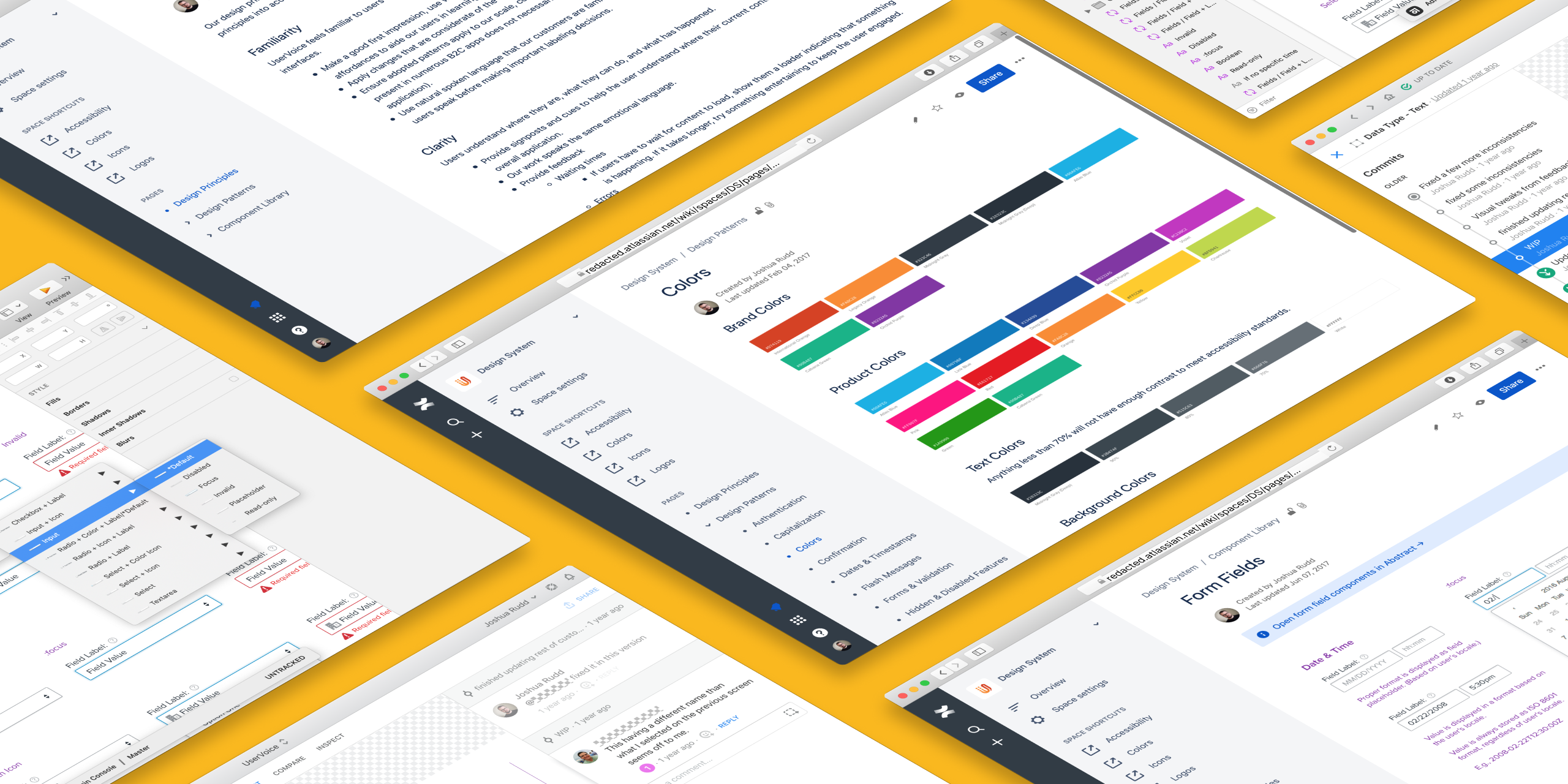
For this initiative, we focussed on three aspects (or layers) to our design system: design principles, design patterns, and the component library. Once those were established, we then focussed on how to deliver and maintain the design system.
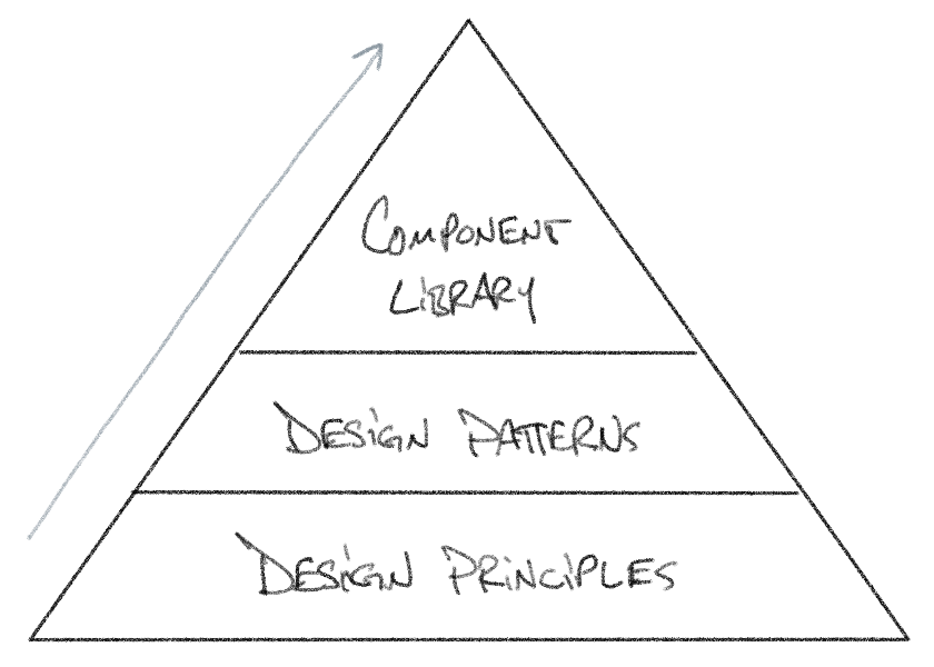
Layer 1: Design Principles
It’s always tempting to start with what’s visible first, but we quickly learned that we needed to figure out what our design principles were in order to guide the process and output of work being done.
To start, each member of the design team did their own research and compiled ideas for our design principles. We then came together to share, find similarities and differences between them, and discuss which ones interested us most as a team. I then took these and compiled a single Google document, combining and incorporating the ideas that resonated most.
At this point we had about two dozen principles—way more than we needed! Through a couple of follow-up discussions—both in person and via comments on the doc—and some heavy editing, we were able to narrow them down to four primary design principles (each had additional notes and examples):
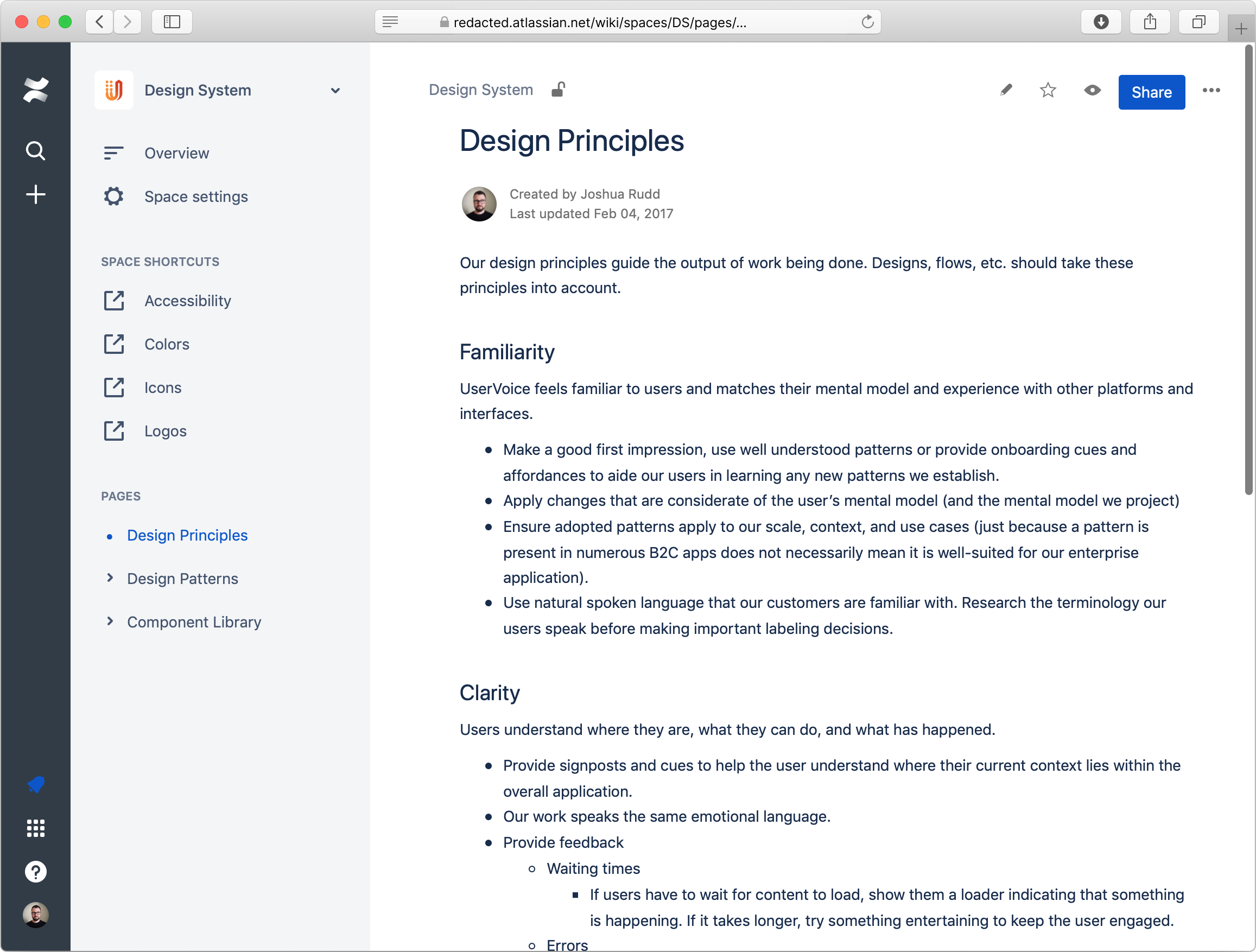
Familiarity: UserVoice feels familiar, and matches people’s mental model and experience with other platforms and interfaces.
Clarity: People understand where they are, what they can do, and what has happened.
Efficiency: Stay out of people’s way and help them get their job done as efficiently as possible.
Consistency and Structure: The look, feel, and behavior of our platform is consistent with itself.
Now we had something that could guide our design decisions.
Layer 2: Design Patterns
As with any product that exists in the world, there were already countless inconsistencies across the UserVoice platform—such as how to display date and time formats, capitalization rules, and form validation and behavior. Each time a feature team set out to tackle a new problem, the same questions would come up: How should we format this? and How should this behave?
To address this, we set out to describe UserVoice’s design patterns. Similar to software design patterns, these were not specific visual styles or implementation details, but rather formalized best practices describing how to solve common and repeated problems in many different situations—universal quality criteria for broad design mental models, content, and behavior. (In contrast, the component library detailed product-specific styles and implementation of these patterns.)
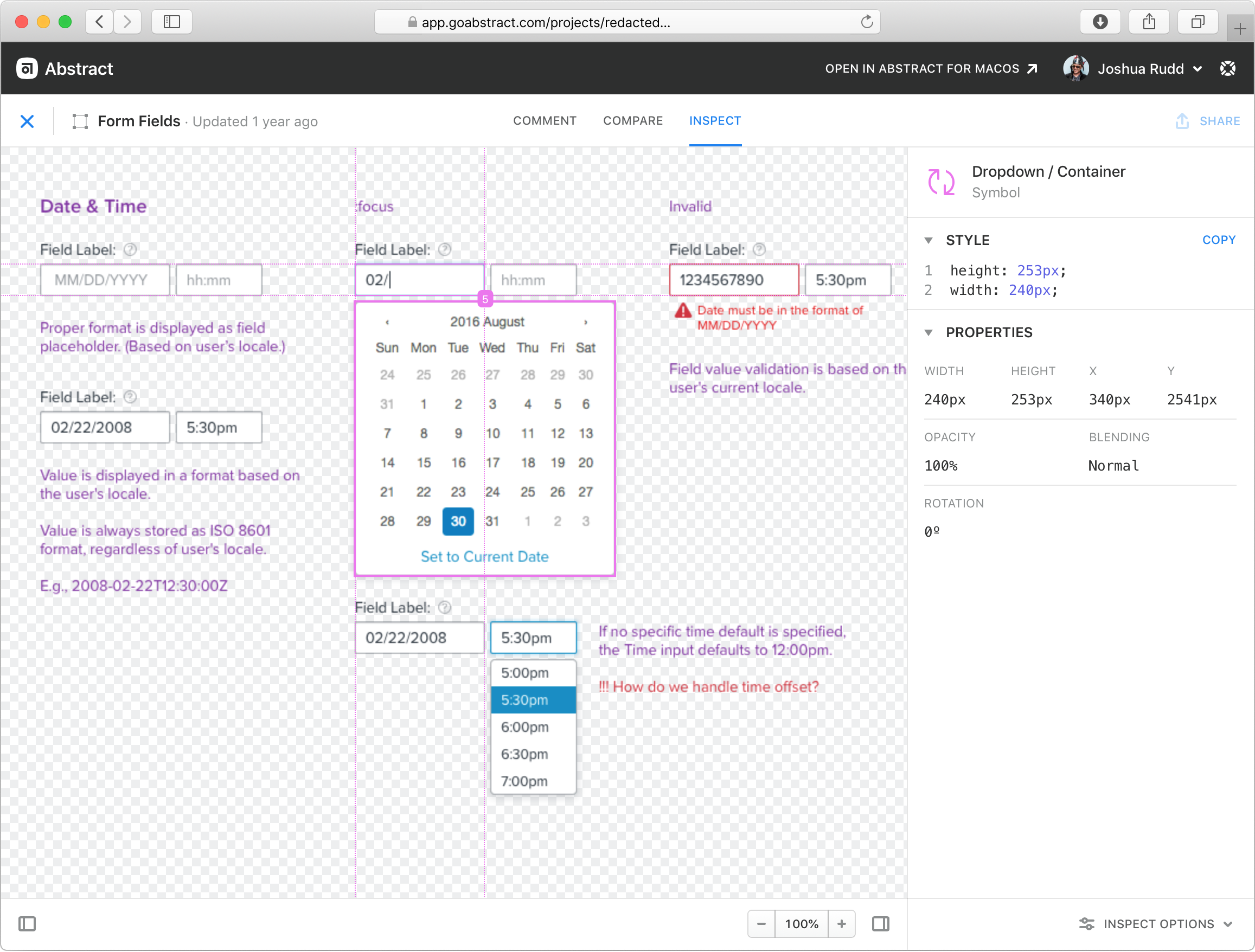
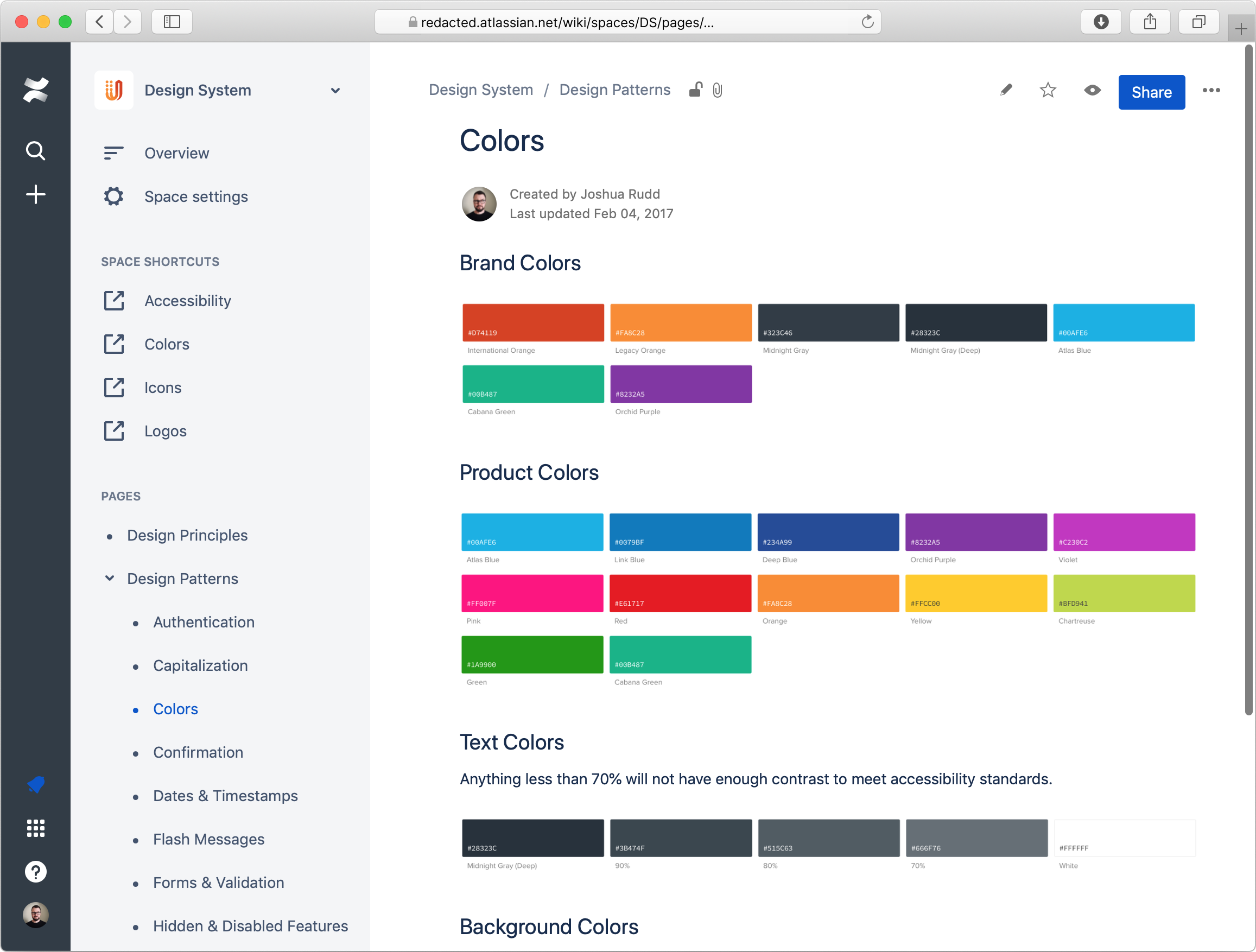
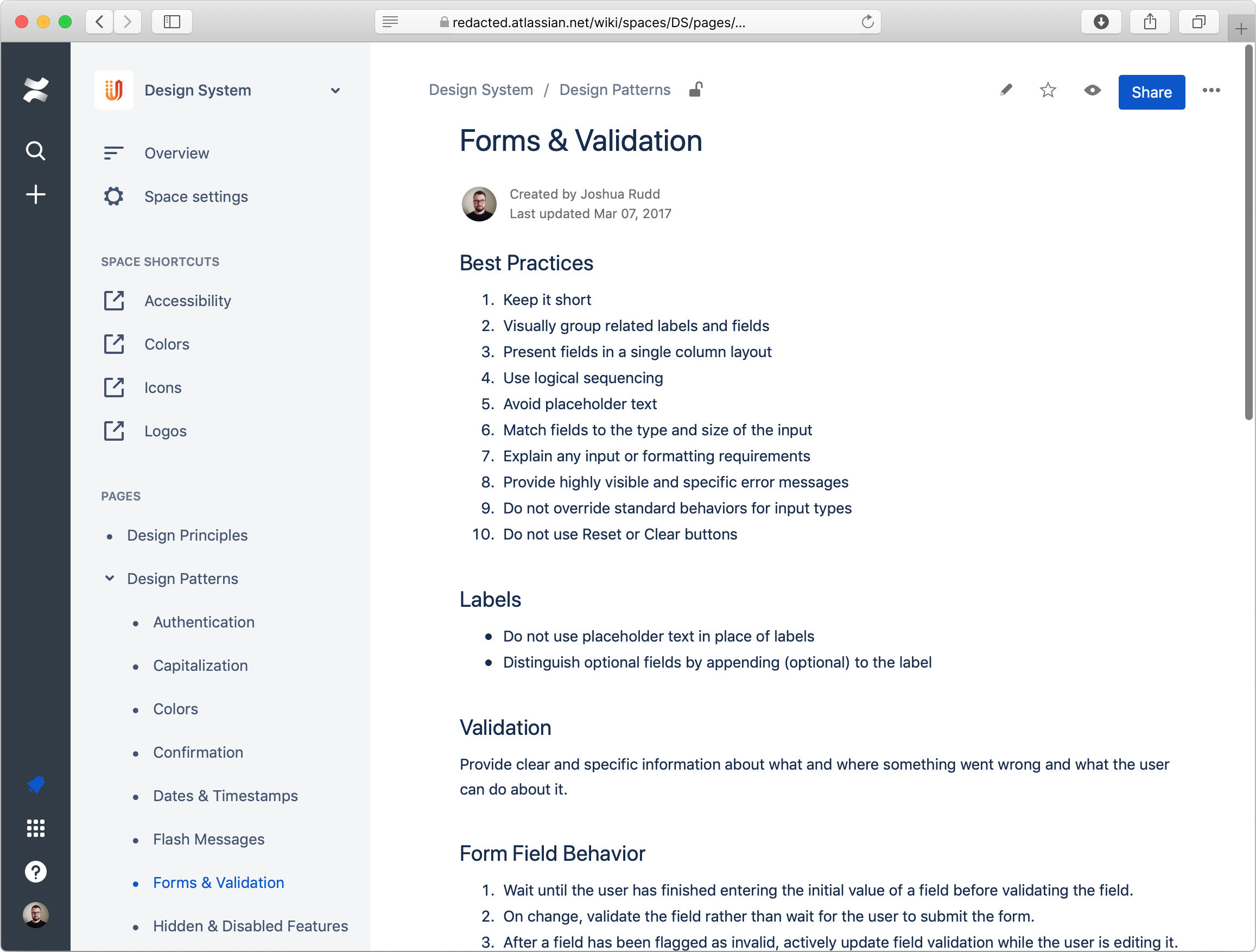
One example is Forms & Validation, which describes best practices, proper use of labels, validation behavior for fields and submit buttons, keyboard controls, and other accessibility requirements. Additional patterns included Capitalization, Confirmations, Date & Timestamps, Flash Messages, Keyboard Controls, Hidden & Disabled Features, Page Titles, Undo, and more.
Unlike our finite set of design principles, our design patterns were a much larger set of living documents. Because of this, the design team committed to defining patterns as part of their ongoing work. For example, when a project needed a form, if pattern documentation for forms didn’t exist we’d work together to audit existing patterns and behaviors, refine them as necessary, and document the desired pattern. The next time a form was created, the designers and developers could reference the existing “Forms and Validation” design pattern.
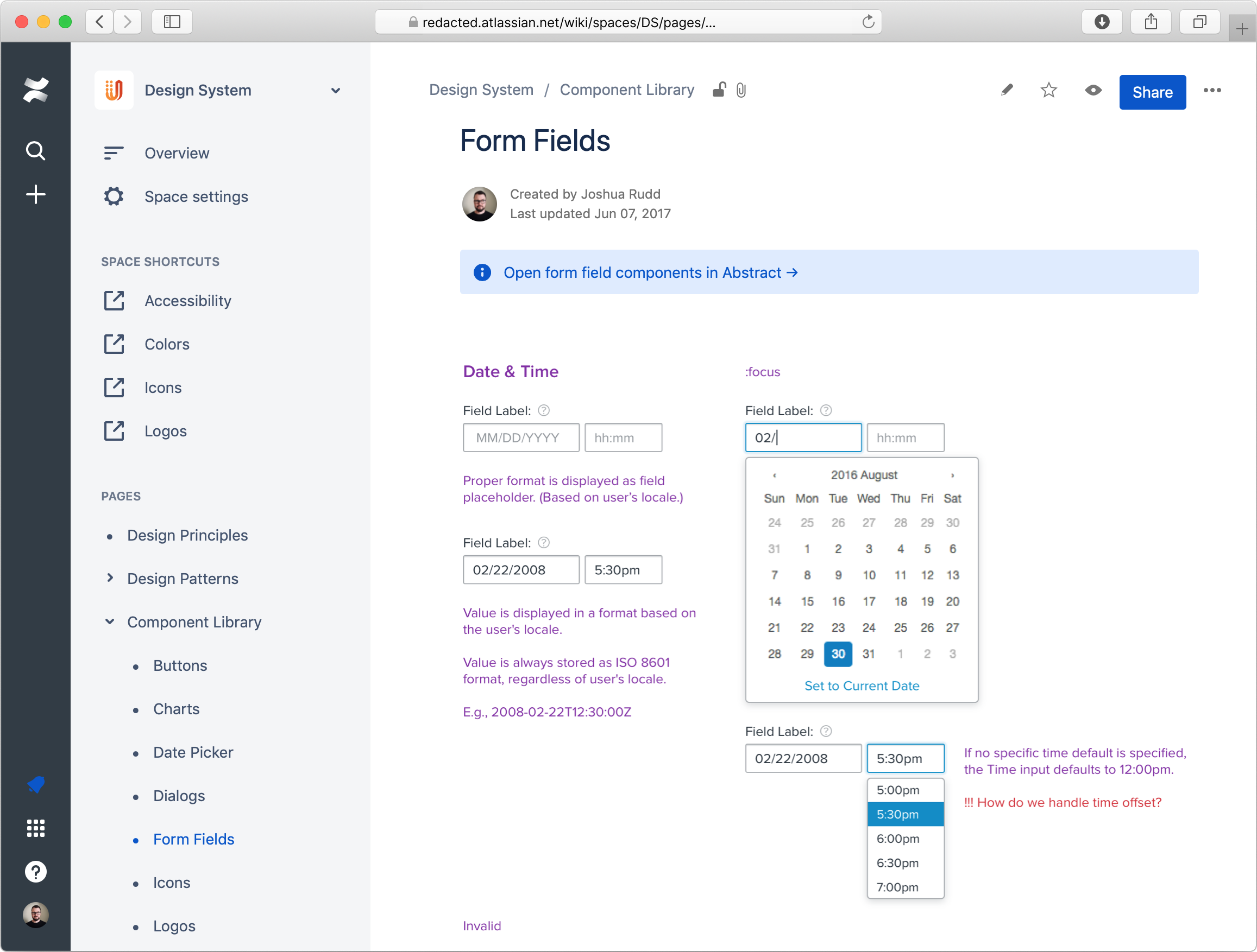
Layer 3: Component Library
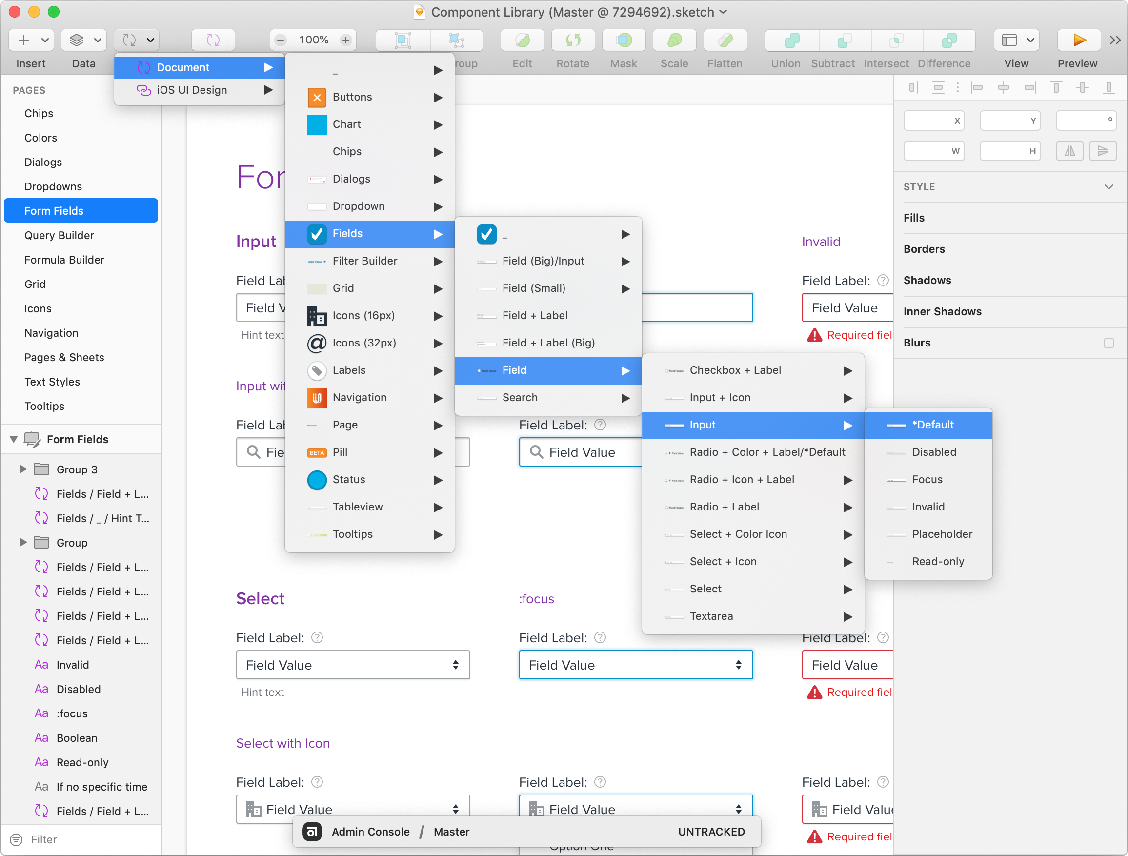
With our principles and foundation for documented patterns in place, our next challenge was to unify our visual design toolbox, or component library. Because each application in the UserVoice platform targeted different audiences, contexts and had different styles, we created separate libraries for each (e.g., Admin Console, Sidebar, Widget, Mobile SDKs).
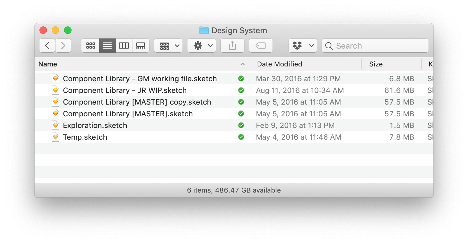
For the previous 6 years at UserVoice mockups had been primarily designed with Adobe Illustrator. Sometimes designers would share files with each other to reuse the same objects someone else had created (buttons, menus, dialogs, etc.), but there was no central management, and oftentimes it was easier for each person to recreate these on the fly, creating small inconsistencies between each designer. If someone needed a form field, they created it from scratch, trying to make it look like the others. This resulted in an inconsistent and incomplete set of components to work from, and often led to developers wondering how representative the designs were to how they should actually be implemented.
By 2016 Sketch had not only gained the admiration of designers everywhere, its performance, nested symbol handling, and transition to using single files (rather than packaged contents) finally made the switch from Illustrator very compelling. Still, we had to figure out how might we create a source of truth for our common components and make it really easy for designers to both use and contribute to the component library. This was still long before Sketch had released external symbol library files.
Creating a Source of Truth
We tried both Git and Dropbox, but quickly dropped Git because it didn’t handle binary files very efficiently. The challenge with Dropbox was that there was no clear way for multiple people to contribute to the same library without running into conflicts, and it still didn’t solve the problem of ensuring everyone’s separate design projects were using the same components. We also tried creating a component library project with InVision, which we’d already been using since 2011, and using its source files sync, but that was even more cumbersome than Dropbox.
Fortunately, along came Abstract App, a new Git-like version control system for Sketch files. In November 2016 we began testing the private alpha, and committed to adopted it beginning January 2017. With Abstract, we were able to create a different project (repository) for each of our primary applications. Each project consisted of a single Sketch file that contained all the symbols necessary for that application’s component library (again, this was before Sketch introduced external symbol library files).
Each time a designer began working on a new project, they’d create a new branch based off the Master file and go to town. All the symbols/components they needed to work from were available in their file. When any components were updated in the Master file during the life of a designer’s project, they could easily pull in those changes to their working file and all of the components would be updated to reflect the source of truth. Likewise, any new or modified components they worked on would become available to everyone else once their work was completed.
Finally, we had all the benefits our developers had with Git. As with our design patterns, the team committed to building out the component library alongside existing projects.
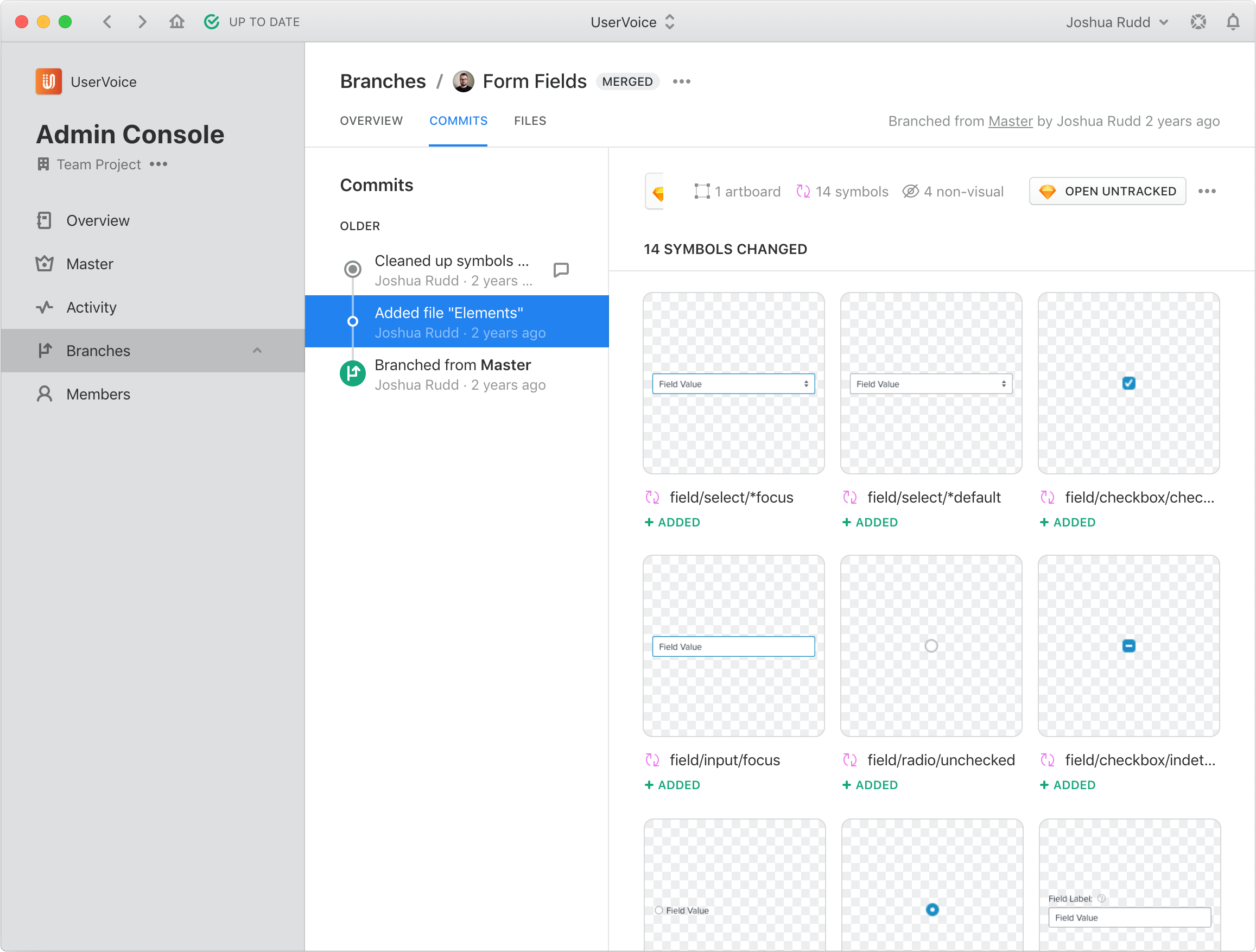
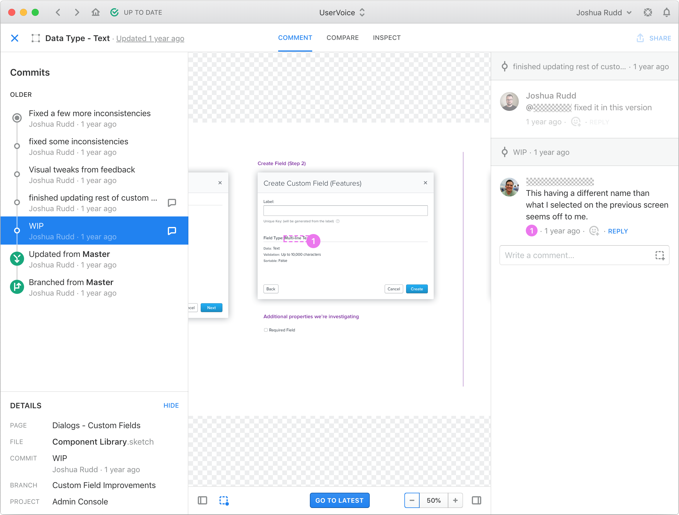
A huge benefit of having full version control of our component library was that changes and conflicts were easy to track, discuss, and resolve (if necessary). In addition to our regular critiques, when a designer’s project was ready to merge back into Master the whole team would come together for a design merge ceremony to review changes to the component library. It kept everyone mentally in sync of how each designer’s work would affect the others’.
Pulling it all together
So where did we publish and share our design principles, patterns, and component libraries?
Documentation is only useful it helps people get their job done. If they don’t know about it or reference it, there’s no point in having it. Since the audience for these were primarily designers and developers, it needed to be somewhere both parties would remember to access it and easily contribute to it.
After some informal discussions, I came up with this list of must-haves:
- Available to anyone at the company
- Easy to search, browse and link to specific documentation
- Easy for designers to update and maintain
- Changes can be tracked
- People can subscribe to changes and additions
| Should we use ____ to document and share our design system? | Affirmative | Negative | Interesting |
|---|---|---|---|
| GitHub |
|
|
|
| Google Docs |
|
|
|
| Confluence |
|
|
At first we tried using an internal Github project, but the learning curve for some designers was a bit high, and it wasn’t familiar to most non-developers. Google Docs was commonplace, but notoriously difficult for people to find and discover things. After a few months, the engineering team began using Confluence for some of their own documentation, so we quickly adopted it for documenting, discussing, and refining design patterns as well.
Outcomes
So, did the design system help us achieve our objectives? No.
But we did achieve our objectives.* While we saw significant improvements in sprint velocity, improved platform cohesiveness, and bonding of the design team over the course of the year we developed the UserVoice Design System, these achievements could not be attributed to the design system itself — but rather to the habits and process of conversation. The documented design system was simply a recorded artifact of that work.
* (You’ll have to take my word for this because we relied more on anecdotal evidence rather than performing quantitative analysis — something I’d do differently next time.)
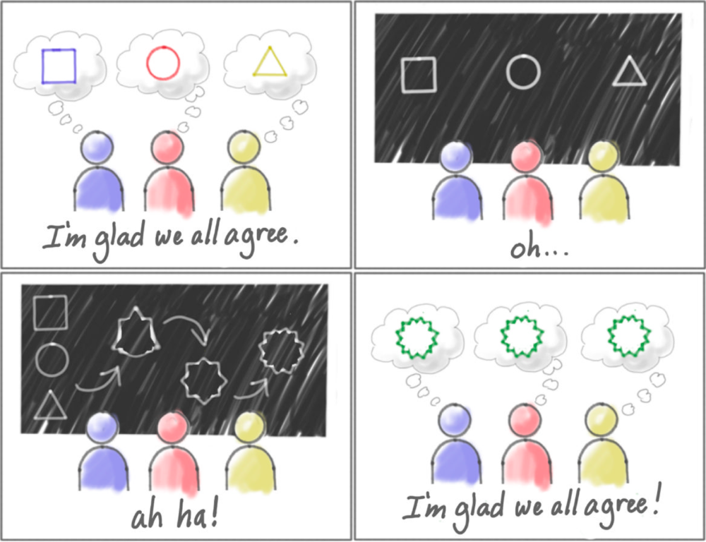
Shared understanding
I’m a firm believer in Jeff Patton’s saying, “Shared documents are not shared understanding.” 1 Essentially, just because you write something down and share it, it doesn’t mean the audience will understand it, agree with it, remember it, or even read it. Communication and understanding require much more than a document, so saying, “Well, it’s documented in the design system!” isn’t an excuse. Essentially, we couldn’t rely on documentation alone to cultivate a shared understanding of our design system.
I believe shared understanding happens through conversation, so we started making a habit of referencing our design system during design exercises and development sprints. During design critiques, we began discussing design decisions in light of our principles and patterns. Slowly, over time, it became a resource we could pull from and contribute to as a team.
New habits
- Weekly design critiques
- Weekly design merge ceremonies
Learnings and insights
Separating design patterns from the styled components helped us separate form from function, making it much easier to update our styles and components over time, and apply different ones to different applications—much like how CSS can apply radically different styles to well formed HTML without changing the structure of the content.
Also, it probably goes without saying, but no design system or process is perfect. While having a design system helps reduce the number of decisions that need to be made, it is not infallible. New problems and challenges can’t always be solved with existing solutions, so it’s important to recognize when you’re trying to force an existing pattern or component to do things it wasn’t intended to. We ran into this a couple of times, and the results weren’t great.
Ideas for next time
-
Find ways for tighter integration between coded components and design prototypes - UXPin’s forthcoming “Merge” functionality seems particularly interesting.
-
Our fourth design principle, Consistency and Structure, became a major point of contention during early design critiques. Doing or using something once does not make it a pattern, but our conversations often veered towards making designs consistent with other things we’ve designed rather than, as Jared Spool posed, “Will the user’s current knowledge help them understand how to use what I’m designing?” Next time I’d push for removing consistency from the design principles and focus more on familiarity, with an emphasis on the user’s current knowledge, or “sum of all their previous experiences with relevant products and designs.” 2
Endnotes
-
User Story Mapping, by Jeff Patton. ↩︎
-
Consistency in Design is the Wrong Approach, by Jared M. Spool. ↩︎